One Room Challenge - Week 1

I am so excited to announce I will be participating in the Spring 2019 One Room Challenge! I have been following this biannual challenge for years and have always wanted to join. This year was the perfect storm for joining, having just moved into a new home that needs lots of renovating and having the ideal project to attack - my guest bathroom. We did a pretty major renovation right away, overhauling the main living area and kitchen, so needless to say my budget is pretty tight for this one. But when budgets are low, the need for creativity is high, so I thought it would be a great endeavor to share!

If you are not familiar with the ORC, it was the creation of blogger Linda Weinstein back in 2011. Seeking motivation to complete one room in her home, she sought the support of a small group of online friends and challenged them to also complete one room in their homes in 6 weeks. Eight years and thousands of rooms later, this has become one of the most anticipated events in the design community. Every April and October, design enthusiasts participate in this 6 week challenge and share weekly updates with their followers, with the big reveal on week 6. Sounds fun, right?!?

Now let me share a little bit about the project I will be submitting. Like I mentioned, we recently purchased our home in September, 2018. It is one of the most unique homes I have ever come across, which is the main reason my husband and I fell in love with it. It was built in 1982 by an architect who had an affinity for ships and designed it to feel as if you are actually in one. In this 2-story structure, the living area and kitchen are located on top and the staterooms (bedrooms) are located below deck on the bottom floor. The unique architecture, wall-to-wall windows and nautical motifs accentuate the ship-like feeling of the home. There are even 2 mermaids carved into one of the wood beams in the ceiling. Like I said, it is definitely unique!

When it comes to renovating this home, it is a fine balance of keeping the intended integrity of the design, but doing it a way that is current, timeless and a little bit understated. I had formulated a pretty specific vision for the home the very first time we viewed it. We came home from the open house and I filled a Pinterest board with ideas that night. After showing my husband my vision, we put an offer on the house the next day.

The first projects we tackled after receiving the keys, were to replace the floors upstairs and paint the walls a nice bright white. We also painted the kitchen cabinets and family room built-ins in Benjamin Moore Black Jack. New quartz kitchen counters, lighting and a farmhouse sink were also on the list. I knew my next project would be the upstairs guest bath, but having just finished all the other renovations we needed a bit of a break. Then I saw the call for the ORC and thought, why not?

This is what the bathroom looks like in its current state:
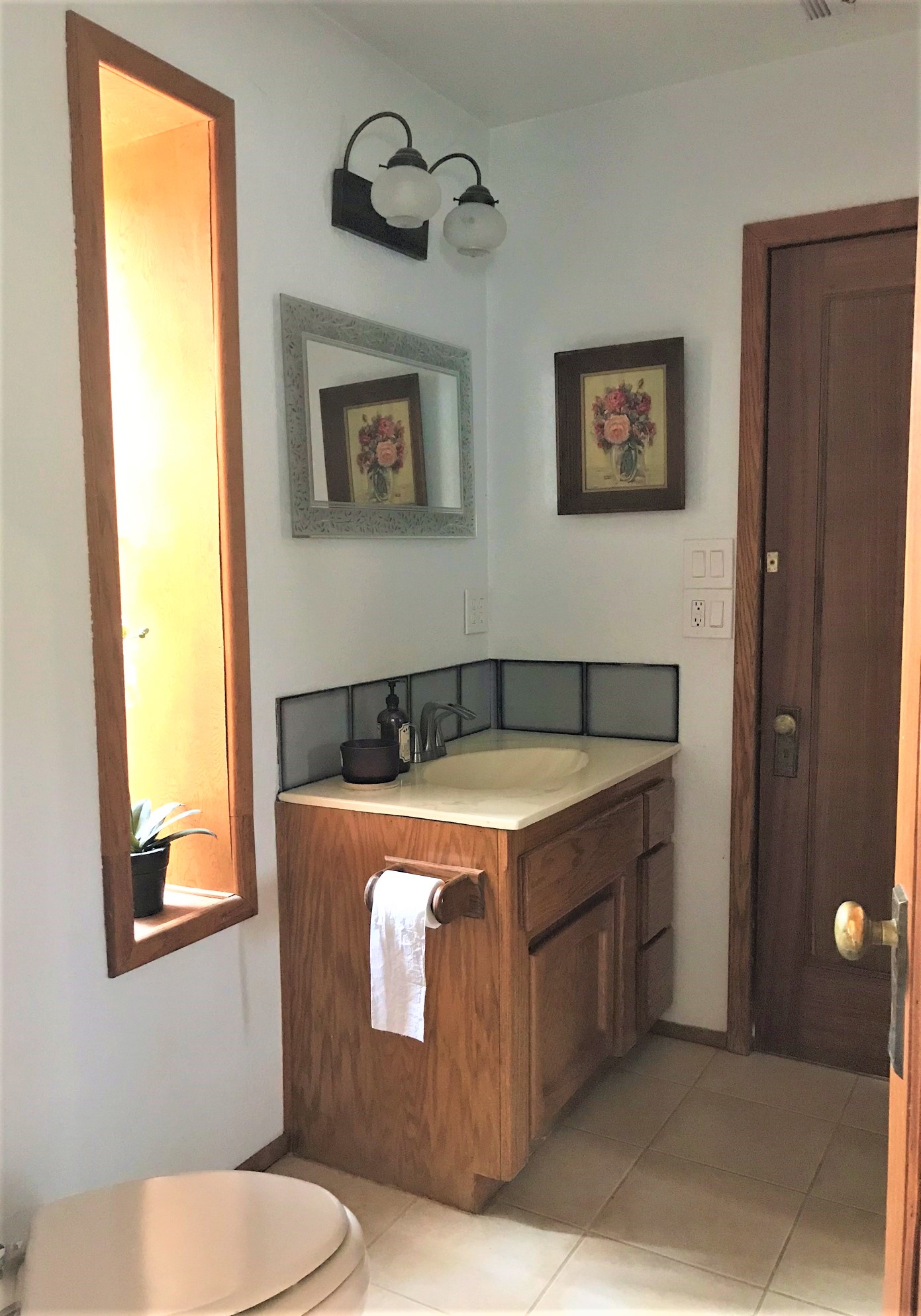
ORCBathroomBefore

Before

Outdated finishes & lack of vision

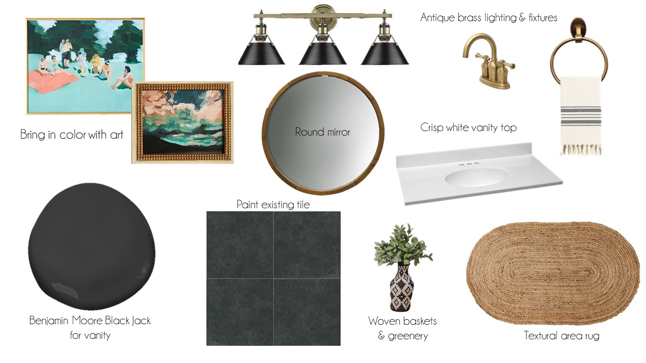
So here are the items on my list for this renovation:

  1. Remove and replace vanity top and backsplash

  2. Paint existing vanity

  3. Add hardware to vanity & new faucet

  4. Install towel ring

  5. New mirror

  6. New light fixture

  7. Custom shelves for tall, narrow window

  8. Paint tile floor

  9. Area rug

  10. Art & accessories

ORCBathroomVisionBoard.png

My vision for this guest bath is to bring in a cohesive color palette of charcoal and white with accent colors of coral and blue. The vanity will be painted with Benjamin Moore Black Jack. This is what I used for my kitchen renovation and I’m pretty sure I have enough to complete this project. Yay for the budget! The fixtures will be replaced in an antique brass finish, which looks amazing next to Black Jack. The mirror will be round, which fits the space better, and in a warm wood finish. The biggest, and scariest project will be painting the existing tile floor. It is definitely not in the budget to replace right now, so I am willing to give this a try. I have watched numerous videos on the subject and it seems fairly easy. I will let you know how THAT goes!! Another project I am thinking of is adding shelves to the awkward, narrow window. I am still formulating a plan for those, so you will have to stay tuned to see what I come up with. Lastly, I will be adding color and texture with art, accessories and an area rug.

ORCBatchroomConcept.jpg

Can I get it all done in 6 weeks? I have a schedule for each week of what I want to accomplish, so I’m pretty sure I can do it. Check back each Thursday to see the progress and the big reveal will be on May 6. Also, be sure to go to the One Room Challenge site to see what the other participants are up to! Now I have to get to work, so see you next week!

Target's new collaboration with Chip & Joanna Gaines

This last Saturday, I was doing a little shopping at my local Target and noticed a huge tent set up at the back of the store. You could hear all kinds of shuffling, mumbling and laughing going on behind the secrecy of the tent. I was so curious as to what was going on in there, I tried to find an opening to take a peek. I caught a disapproving glance from a Target employee who saw what I was trying to do, so I abandoned my effort and went on with my shopping.

The next morning I was basking in the glory of gaining an extra hour from the end of Daylight Savings when I got this text from my daughter "I bet the tent at Target was the Joanna Gaines stuff. It launches today!" 

You see, we have been discussing the launch of this collaboration for several weeks now. With the popularity of their show, Fixer Upper, it was only a matter of time before Target jumped on the bandwagon and featured their product in their stores. So, with mild curiosity, I decided to leave the comfort of my pajamas and head on down to Target to see what the fuss was about. 

I entered the parking lot at approximately 8:15 a.m., 15 minutes after the doors opened. There were a smattering of cars, but not what I would call overly full. I really thought there would be more people, so maybe all the hype was just that, a bunch of hype. Even as I went inside, I only spotted a few other customers in the store. Great, I thought, I will get to view the goods without a bunch of other shoppers getting in my way.

I grabbed a cart, not that I was really intending to buy anything, but wanted to be prepared just in case. I made my way to the back of the store where I had seen the tent the day before. All of a sudden I started to hear a mild humming, like a swarm of bees in the distance. As I got closer, the humming turned into voices, the voices of approximately 50 frantic, giddy shoppers piling home decor products into their carts. I quickly realized that the store was not empty, they all just happened to be in one department, the Chip & Joanna Gaines Hearth & Hand department.

It was sheer pandemonium! Items were being ripped off the shelves at record pace, shoppers with two and three carts per person, piled high with candles, blankets and vases. I had never seen anything like it. Before I knew it I got caught up in the action as well. I don't know if it was the attractive home decor at ridiculously low prices that got me, or the competitive nature of what was happening. I spotted a shopper ogling a Christmas wreath, the last one on the shelf, and out of nowhere I grabbed it and threw it into may cart! Sorry lady, you snooze you lose (and if that was you at the Roseville Target Sunday morning, my sincere apologies).

Twenty minutes later I'm standing in the checkout line, dazed and confused. I can't even remember putting all of these things in my cart, but there they were, smugly staring back at me. Do I really need these Christmas kitchen towels? Or this balsam spice candle in the galvanized tin (that by the way smells exactly like a walk through a forest)?. Yes, yes I do!! The lady in front of me had three carts full, so I didn't feel quite so bad.

I made it home with my wares and sheepishly carried all my bags into the house. "Just going to check it out, huh?" my husband says with the faintest hint of sarcasm in his voice. "I needed to do some research for the blog"  I said ;)

I'm not sure what is left from the collection, but this is what made it into my cart:

This is the wreath I stole from the unsuspecting shopper. Sorry, not sorry!

This is the wreath I stole from the unsuspecting shopper. Sorry, not sorry!

I got this for my new granddaughter. My grandson's stocking is solid green so this will coordinate perfectly!

I got this for my new granddaughter. My grandson's stocking is solid green so this will coordinate perfectly!

The aforementioned balsam spice candle in galvanized tin (that smells exactly like a walk through a forest)

The aforementioned balsam spice candle in galvanized tin (that smells exactly like a walk through a forest)

I am actually always on the hunt for simple gold frames for styling bookcases. I might go buy more of these!

I am actually always on the hunt for simple gold frames for styling bookcases. I might go buy more of these!

See, I couldn't put them back! And for any family member reading this, do not use these for cleaning purposes. These are just for hanging in the kitchen and looking cute!!

See, I couldn't put them back! And for any family member reading this, do not use these for cleaning purposes. These are just for hanging in the kitchen and looking cute!!

I love tall vases like these anytime of year for displaying branches. But at Christmas, I will use evergreen cuttings!

I love tall vases like these anytime of year for displaying branches. But at Christmas, I will use evergreen cuttings!

Ok, I kind of love this taper candleholder! It will be great for the holidays filled with greenery, but you can mix it up the rest of the year with other things.

Ok, I kind of love this taper candleholder! It will be great for the holidays filled with greenery, but you can mix it up the rest of the year with other things.

I am seeing black candles everywhere lately instead of the usual white. I'm a fan!

I am seeing black candles everywhere lately instead of the usual white. I'm a fan!

I did manage to get one Christmas gift off my list. Hopefully my grandson doesn't see this (I know he's only 3, but he's pretty computer savvy).

I did manage to get one Christmas gift off my list. Hopefully my grandson doesn't see this (I know he's only 3, but he's pretty computer savvy).

So, here are my final thoughts on this highly anticipated collection. My design aesthetic leans more towards Bohemian chic than modern farmhouse, but there were plenty of things that blended quite nicely with my design style. In fact, if you are just looking for some basic filler pieces, at a great price point, you will probably find some things that work for you too. The simplistic nature of their collection will work with most design styles, including modern, industrial, traditional and of course their mainstay modern farmhouse. I think the reason they are so popular is they have tapped into what everyone wants for their home, a warm, beautiful place to share and create memories with the ones you love.  

I would love to hear if anyone else braved the crowds for the big launch. Let me know your thoughts and what you purchased in the comments!


Need help with a decorating project? Let's get started today! 

My top 10 favorite paint colors for home staging

One of the best things you can do to get your home ready for sale is to give it a fresh coat of paint. A nice neutral color let's potential home buyers visualize their furnishings in your space and gives it that "move-in-ready" appeal.  That perfect shade of red you agonized over in your dining room may be perfect for you, but not necessarily right for the majority of buyers. A versatile choice like gray, however, will work with all styles and and all accent colors.

So, now that I've convinced you to go ahead and pull out the brushes and rollers, what color do you choose? Standing in front of that HUGE paint color display can be quite intimidating, I know. Not to worry, I've got you covered with my Top 10 Favorite Paint Colors for Home Staging list. And even if you're not selling your home anytime soon, you might want to consider an update with one of these classic colors.

BM Decorator's White  It's not called Decorator's White for nothing! This is one of Benjamin Moore's Designer Classic colors and is a favorite among homeowners and designers alike. It is a great color to use if you lack natural light and need to brighten things up. It is also a nice backdrop for art collections.

BM Gray Owl  This is a soft, versatile gray that is easy to work with. It is both warm and cool and light enough to work in rooms that tend to be dark. I would use this color anywhere!

BM Simply White  This bright white is perfect for all your trim. If you have lots of interesting molding or wainscoting, paint your trim and walls the same color for simply stunning results!

BM November Rain  This goes a little more cream than gray and has a slight green undertone. It looks gorgeous with warm, hardwood floors and is definitely a classic with Simply White trim.

BM Revere Pewter  This seems to make every designer's top 10 list. It is a classic gray with warm undertones and has a unifying effect that calms and restores. One of my favorite colors to use in a bedroom!

BM Pale Oak  This gorgeous neutral is graceful and elegant. On the paler side of gray, it is another good choice if your home tends to be on the dark side, but will still contrast nicely with Simply White. It works well in a modern, open floor plan.

BM Jute  This is a super creamy beige that is beautiful with spa colors like blues and greens. It really works with anything, but I especially love it in a home with a coastal cottage vibe.

BM Moon Shadow  I dare you to say the name of this color without busting out a little rendition of the Cat Stevens classic. It has been described as "the perfect gray"...it's not too dark...it's not too light...it's just right! For this reason, I'm giving it the coveted Goldilocks Award! 

BM Half Moon Crest  Depending on the lighting, this gray will sometimes have a green or blue undertone. It is a rich, restful gray that will add a level of sophistication to any room. Particularly stunning in a kitchen with white cabinets!

BM White Diamond  Another great white option, this one pairs especially well with cool blues and greens.

All of my color choices are from Benjamin Moore, one of my favorite paint companies to work with. But if you, or your paint contractor, have a specific brand you like to work with, most will do a color match for you. I always suggest buying a small sample to try out in your home, as colors will look different based on the amount of natural light and your home's orientation (north/east facing will appear cooler than south/west facing). And rather than paint directly on your wall, paint a large square onto a poster board. That way you can move it around the room to see how it will look on every surface and you won't have ugly splotches everywhere.

If you live in the greater Sacramento area and need some help getting your home ready to sell, I would love to help! Contact me now to get started!


For more content like this, subscribe to my newsletter

3 tips for perfectly placed artwork

Hanging artwork is something I get asked about all the time. It is also one of the biggest decorating mistakes I see on a regular basis. When hung correctly, artwork can dramatically change the look and feel of a room. It injects color, personality and completes the space. If hung incorrectly, however, things can feel disjointed and out of sorts. It's like wearing the wrong pair of shoes with an otherwise stunning outfit - devastating!

So follow these 3 tips and make your walls WOW instead of WOOPS:

1. How Big - In artwork, size really does matter (insert your own joke here). It matters in relation to where it is being placed, whether above an anchoring piece or on a blank wall. Just remember the rule of thirds, which is most pleasing to the human eye. So whether it is a single piece of art, or a grouping, the overall area should be roughly 2/3 the width of the anchoring piece or 2/3 the width of the blank wall.

2.  How High - Just like a perfectly hemmed pair of pants, artwork needs to be hung at the appropriate height in relation to an anchoring piece of furniture, or the floor if hanging on a blank wall. The biggest mistake I see is hanging artwork too high (think about a pair of pants that are hemmed to short). 

3.  How Far - When hanging a grouping of art, keep it tight. A good rule of thumb is 2" - 3" apart. This may fluctuate depending on the different shapes you are using, but closer together is always better.

And just so you can keep these tips handy the next time you need to hang some artwork, I have created a cheat sheet with all the info for you. Just sign up for my newsletter, Stylish Solutions, and it will be sent right to your inbox. You're welcome! 

In the beginning . . . the first chapter in a new home project

Anytime I take on a new project, especially when it's a brand new home with a clean slate, there is inevitably that feeling of "where the heck do we start?" There are so many decisions to make, flooring, counters, cabinets, fixtures, paint, not to mention furniture and accessories. The thought of it can be quite daunting, but it doesn't have to be. The key is having a plan, and a good plan starts with inspiration. When you have inspiration, all decisions are effortless and just come naturally.

Here is an example of one such project. A brand new home, construction has not even started yet. The clients want something totally different than they've had before. They might keep some artwork and a couple of small pieces of furniture, but that's it. So, where do we start? Let's start at the beginning, the architecture.

The exterior elevation they have chosen is a Spanish ranch style, with arched windows, tile roof and wrought iron fixtures. This is our first, and most important, clue to where our inspiration will come from. Next we talk about color, are they drawn to warm earth tones, like olive greens, reds and gold? Or are they more inclined to cooler blues, greens and maybe a splash of fuchsia? I show them some examples of warm and cool color palettes and they both agree that the cooler blues and greens are the way they want to go. Yes! We are on a roll.

Now that we have a jumping off point, I start my search for inspirational photos to create a mood board. This mood board will be the basis for every decision we make; light fixtures. tile, paint and right on down to the knobs on the cabinet doors. As I sit in front of my computer to get started, what happens next can only be described as divine intervention. I get an email from Wisteria, one of my favorite online sources. It reads "Join the Adventure: destination Andalusia". Hmmm, I'm not a cracker jack geographer, but I'm pretty sure that's in Spain! I click on the link and as the images start to appear I could hear a choir of angels sing "hallelujah"! The inspiration we have been looking for is all right there. Thank you Wisteria!

This is the first mood board, one of many for this project, Color Inspiration:

I will be sharing more details from this project as it progresses, from finish selections to room by room detailed plans. If you would like to follow along, be sure to subscribe here!